A cartography of the eDNA community on Twitter
I recently published on Twitter the result of some experiments to represent the community of users working on the topic of environmental DNA and metabarcoding. These tweets were quite successful, so I’m writing this quick post to keep a trace of them, and expand a bit the story behind.
I had been thinking for some time now about using Twitter data to model this community, probably inspired by projects I saw here and there, and by all the interactions I observe daily between my colleagues.
One network to connect them all
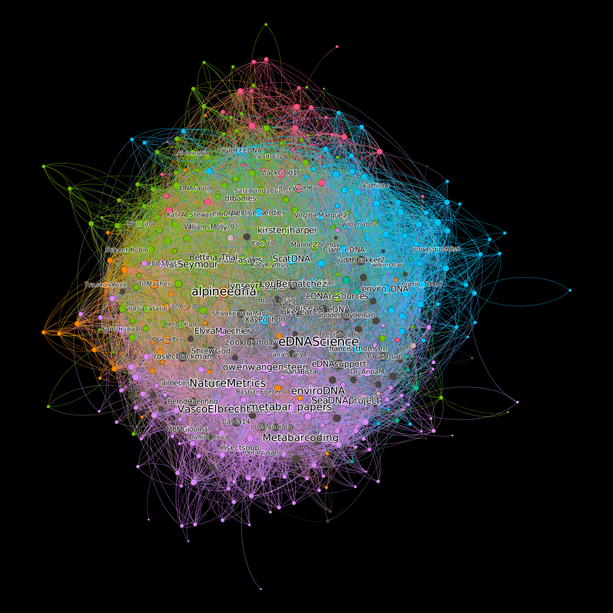
I finally took advantage of a train trip from Zurich to Thonon to look a bit more into the Twitter API, which can be easily queried from R with the rtweet package. I started by collecting all the accounts whose biography contained the keywords eDNA and metabarcoding. I then retrieved all the links between these accounts, finally keeping only the symmetrical links (i.e. two accounts are linked if they follow each other). All I had to do then, was to make a nice rendering in Gephi. I decided to weight the size of each node by its number of links and to color subcommunities automatically detected by the clustering algorithm implemented in Gephi.
Looking back, I think people were happy to be able to see from above a world they virtually visit every day. People also started to look for and find themselves in the graph, which also undeniably contributed to the engagement with the content and its success.
Getting more data
But soon, some limits appeared. Important accounts were not appearing in the graph, simply because they had not included the keywords I searched for in their bio. So I decided to start again with a different strategy. Starting from the 400 accounts of the first graph, I collected all the accounts that these accounts were following, that is to say 92000 accounts including Greta Thunberg and Britney Spears. Of course I had to refine this list. I finally kept 891 accounts followed by at least five users of the initial set and who tweeted or retweeted about eDNA or metabarcoding more than three times in their 100 last contributions.
Collecting these data proved to be a bit time consuming and complicated because of the Twitter API which forced me to take 15 minute breaks in order not to exceed the limits of the free version. But after two days of harvesting, I was ready.
Going interactive
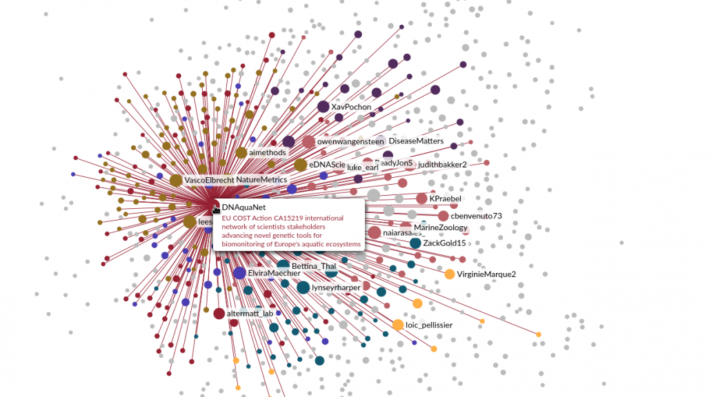
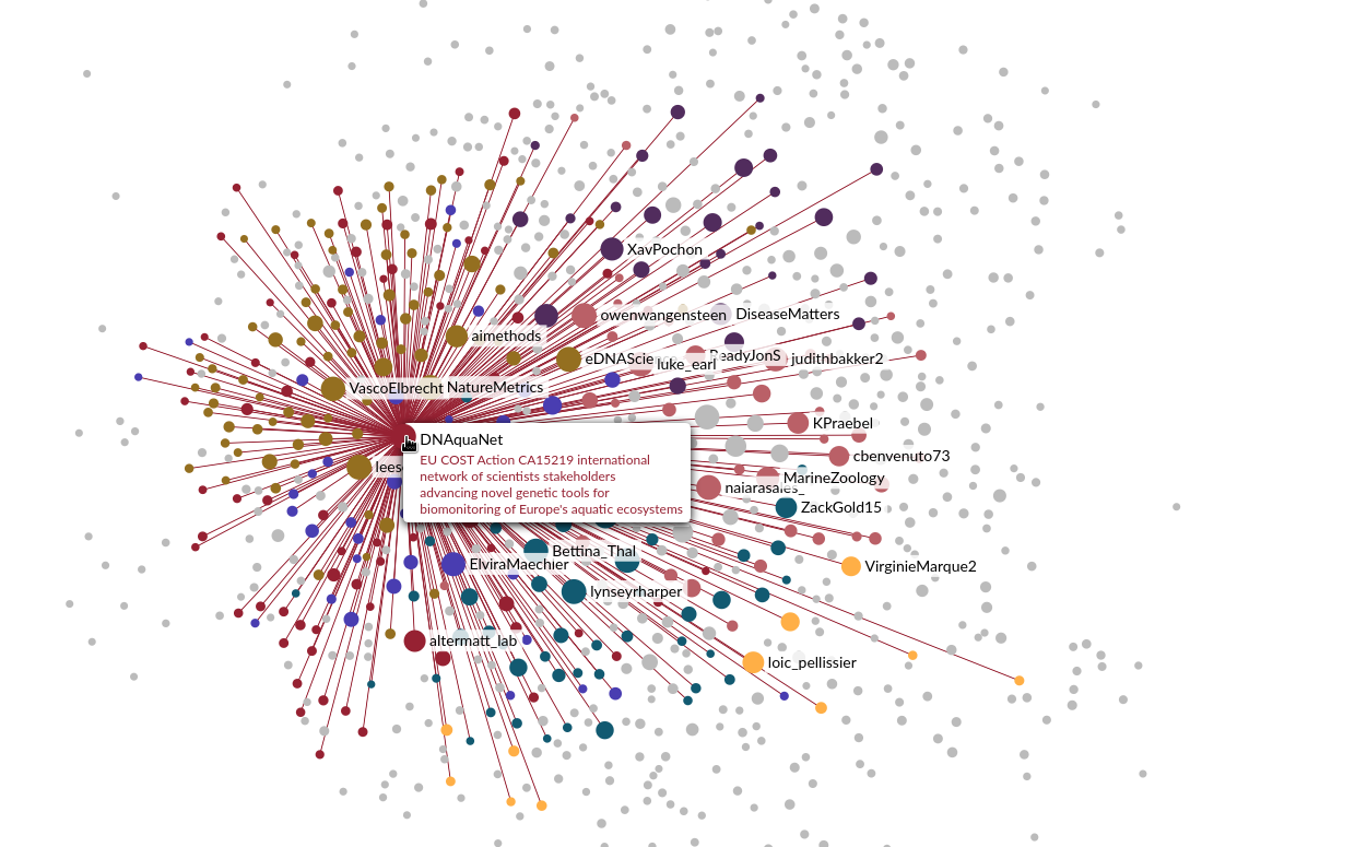
Well, not exactly. I wanted to solve the problem of small accounts that couldn’t be found in the initial graphic and for that I thought it was best to switch to an interactive version. After some research, I decided to use sigma.js, a really cool javascript library. I used their Wikipedia example to create an interactive graph where you can zoom, search for your nickname, show or hide some clusters, etc. I let you discover the result by clicking on the image.

